


Two shirts can carry the same design and feel completely different, because the design sits in a different place. Placement decides how loud a piece is, how often it gets worn, and how comfortable it is against the skin.
Here is what each option actually does.
Tap a spot: what each placement does
Same design, six places to put it. The number shows where it sits.
Left chest, small. Five to eight centimetres, roughly where a pocket sits. The one that gets worn most, and the safe choice for a first piece or a gift.
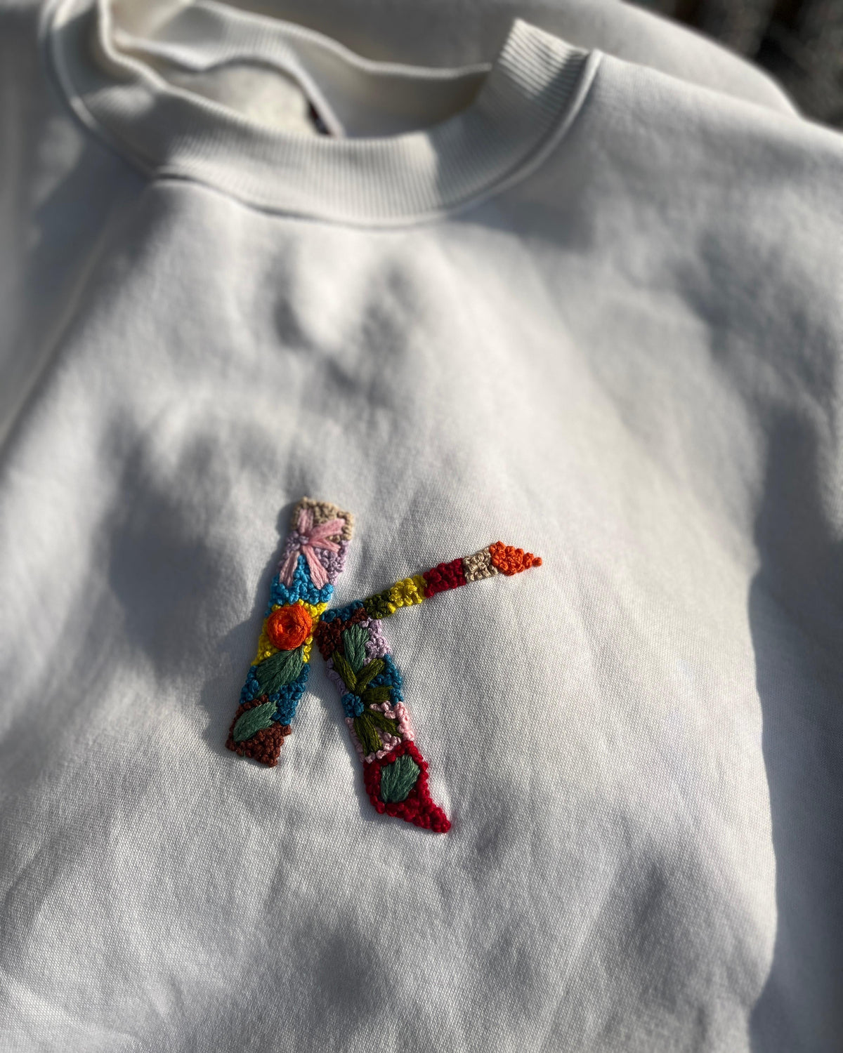
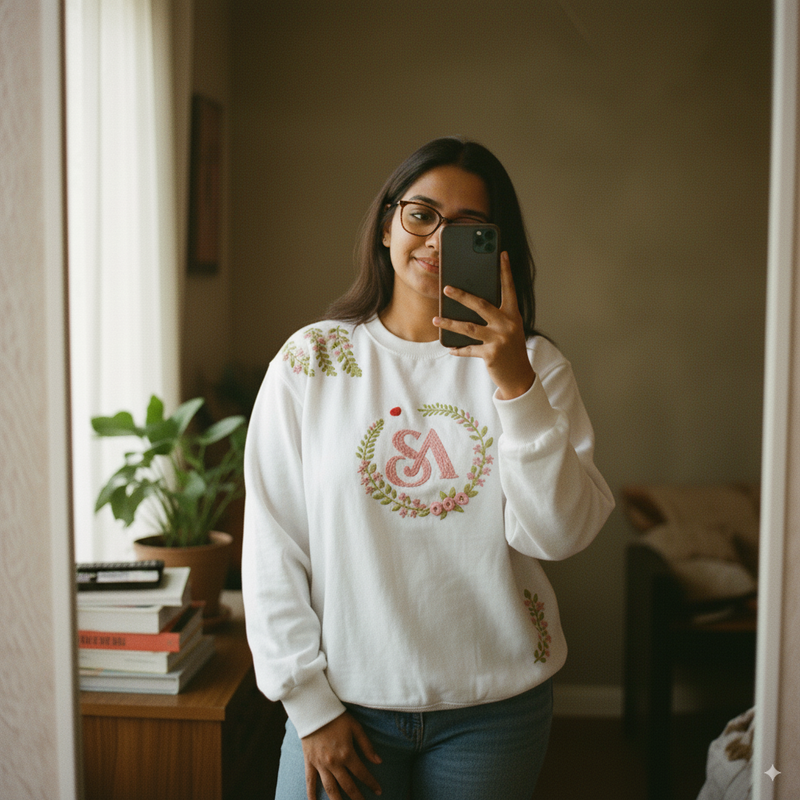
Centre chest, large. The placement people photograph, and the best way to show off filled satin work. It commits the shirt to being the main thing you wear. On an oversized cut it sits lower than you expect.
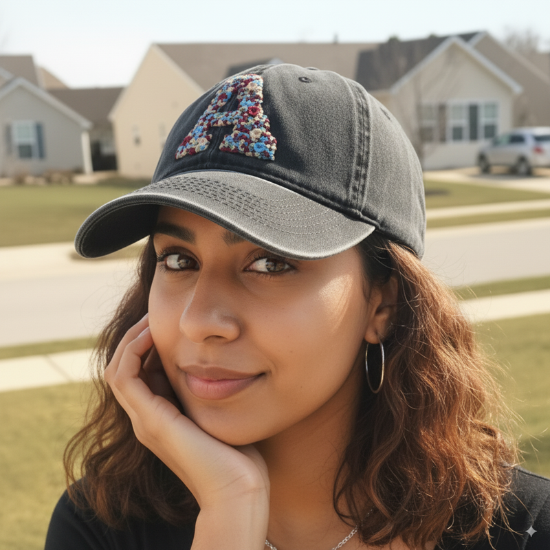
Sleeve. Subtle but present: visible when you want it, gone under any layer. Suits initials and small symbols. Sleeves rub more, so short, dense stitches are best here.
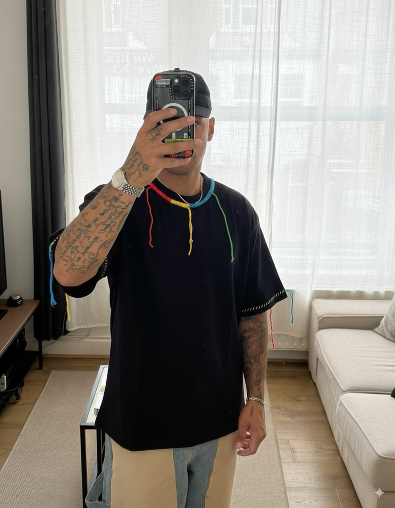
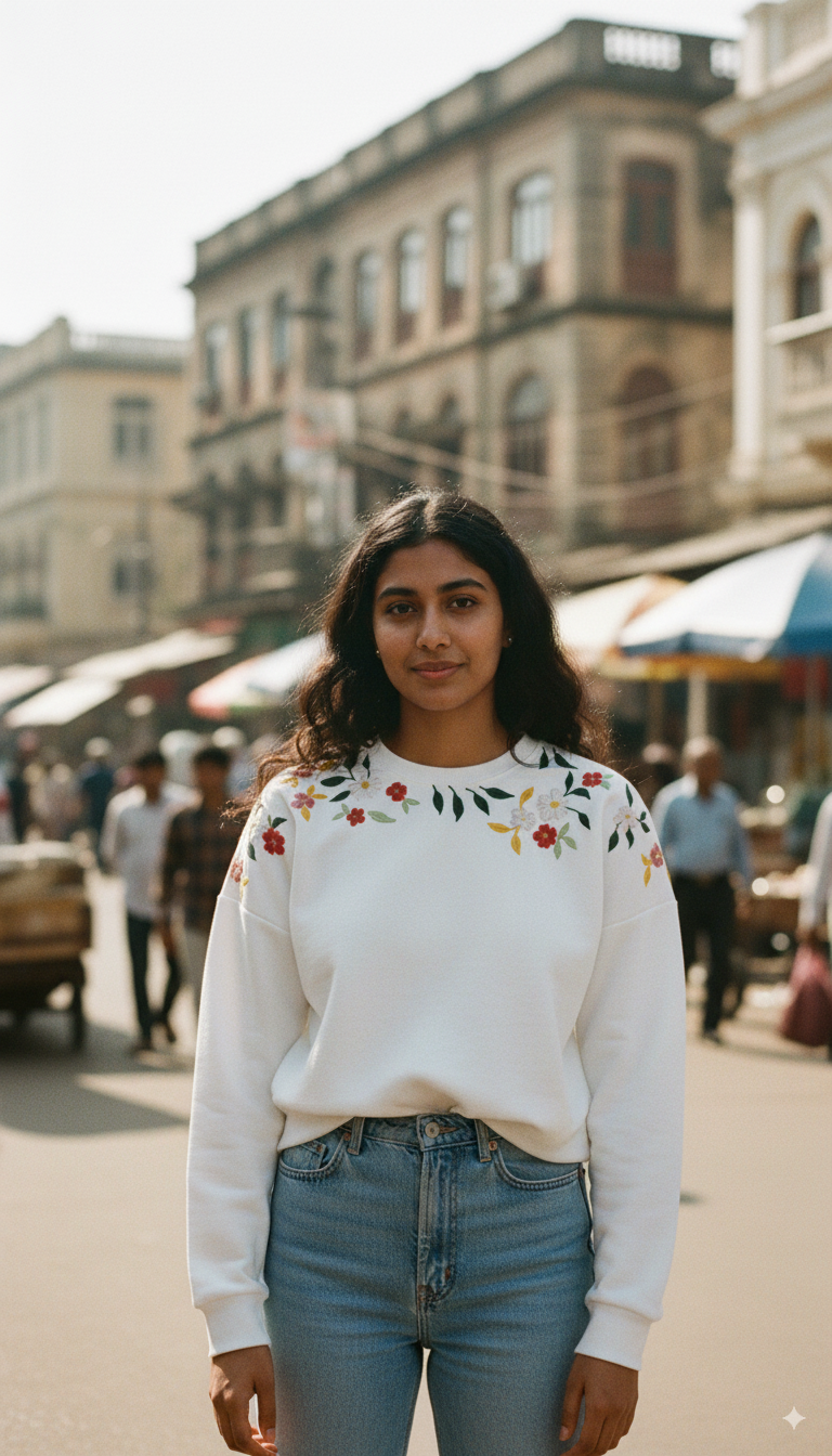
Neckline. The most decorative. It frames the face and makes a plain tee look designed. It also sits closest to the skin.
Back. The largest uninterrupted area, for designs that need room. The drawback: the wearer never sees it.
Hem. Almost a signature. Quiet and private, and it disappears when the shirt is tucked in.
Left chest, small
The classic. A small motif roughly where a shirt pocket would be, usually between 5 and 8 centimetres across.
This is the safest placement and the one that gets worn most. It reads as a detail rather than a statement, which means it works at the office, under a jacket, and on people who do not want to be looked at. If you are buying a first embroidered piece or buying for someone whose taste you do not know well, this is the one to choose.
It also sits away from the skin most of the time, so the textured reverse of the stitching is rarely noticeable.

Centre chest, large
A bigger design across the middle of the chest. This is the placement people photograph.
It has more presence and it shows off the stitching properly, particularly on filled designs where you want to see the satin work. The tradeoff is that it commits the shirt to being the main thing you are wearing. Large chest designs get worn less often than small ones, in our experience, simply because there are fewer occasions that suit them.
One practical note. On an oversized cut, a centre chest design sits lower on the body than you expect, because the whole garment hangs lower. Worth picturing before you order. Our measuring guide covers how oversized cuts sit.
Sleeve
A small motif on the upper arm or near the cuff.
Underrated, and probably the most wearable placement after the small chest. It is visible when you want it to be and invisible under any layer. It suits initials and small symbols better than detailed pictures, because there is not much surface area to work with.
Sleeves take more friction than the chest, from bags, seatbelts and desks. Well anchored hand stitching handles this fine, but it is a reason to avoid long floating stitches in this position.

Neckline
Stitching following the curve of the neck, either just below the neckband or around it.
This is the most flattering placement and the most decorative. It frames the face and it turns a plain tee into something that reads as designed rather than printed.
It is also the placement to think hardest about if you have sensitive skin, because it is the one that sits closest to the neck, where people notice texture most. On a heavier cotton it is usually a non issue, but it is worth knowing. We cover this honestly in is embroidered clothing itchy.

Back
Across the upper back, or centred lower down.
The back gives you the largest uninterrupted area on a t-shirt, so it suits designs that need room. It is the only placement where you can put something genuinely big without it distorting when the wearer moves.
The obvious drawback is that the wearer never sees it. That matters more than it sounds for a gift, because part of the pleasure of a personalised piece is looking down at it.
Hem and side seam
Small stitching near the bottom edge or along the side.
The quietest option. Almost a signature rather than a design. It suits people who want the piece to be handmade without wanting anyone to comment on it.
It disappears entirely when a shirt is tucked in, so it is worth thinking about how the person actually wears their clothes.
Placement for names and initials
Personalised text follows slightly different rules, because text has to be readable.
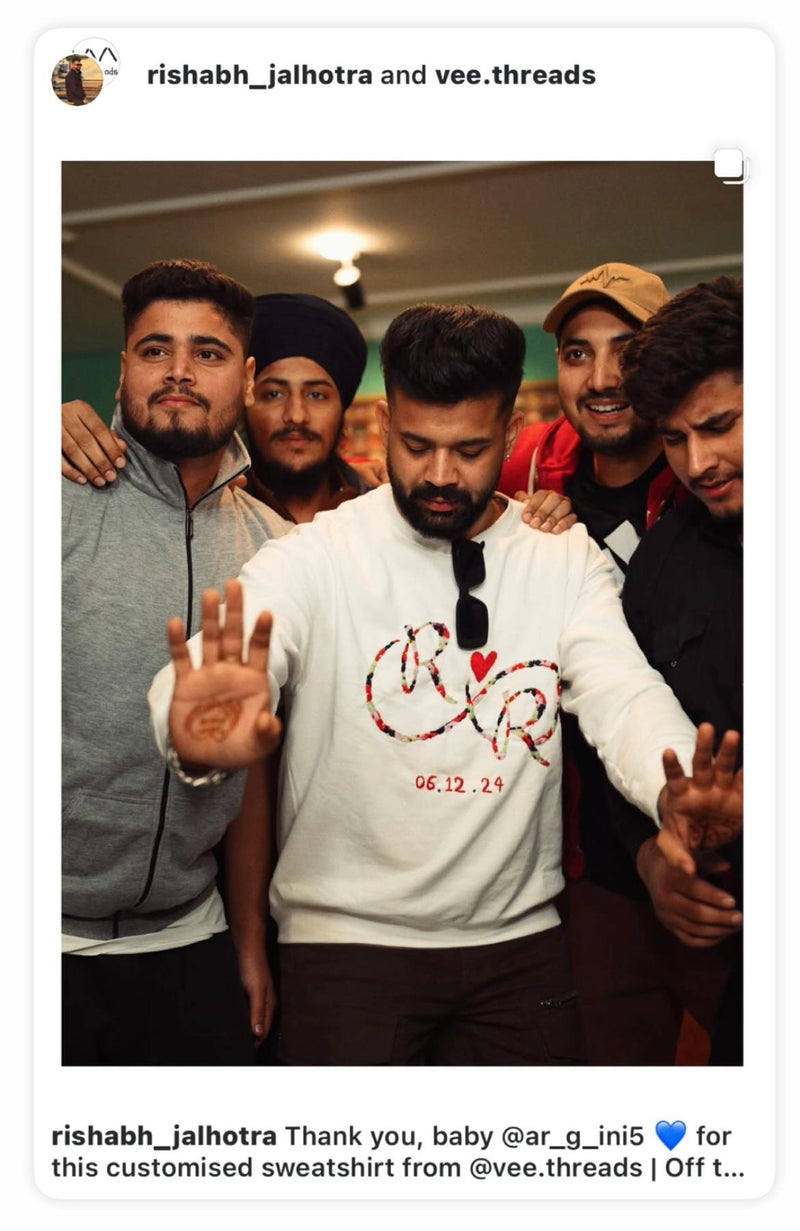
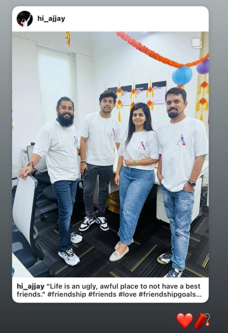
Small initials work almost anywhere. Left chest and sleeve are the two most requested and both look considered rather than novelty.
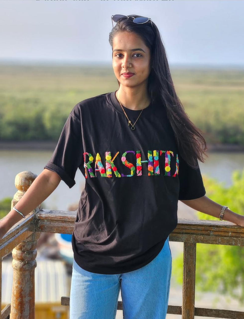
Full names need more room and read best on the chest or the back. A long name squeezed onto a sleeve becomes tiny and hard to read, and small letters are also harder to stitch cleanly, so the quality of the work suffers.
Dates and Roman numerals are usually short, so they suit the smaller placements well. There is more on choosing lettering in our guide to name embroidery styles.
Will the name still read?
A name needs room. Try it in three places.
Initials on a sleeve. Short text suits small spots. Looks considered rather than novelty.
Full name on a sleeve. Squeezed small enough to fit, it is hard to read and harder to stitch cleanly, so the quality of the work suffers.
Full name on the chest. Room for letters big enough to read and stitch well. Chest or back is where full names belong.
How placement affects wear over time
Some positions take more punishment than others.
The chest and back are the calmest areas on a shirt. Sleeves and hems get more rubbing. Anything near a seam moves more as the garment flexes.
None of this is a reason to avoid a placement, because hand stitching is anchored into the weave and does not lift the way a print does. It is a reason to prefer shorter, denser stitching in high friction spots rather than long loose stitches. Our post on whether hand embroidery comes undone covers what actually happens over years of wear.

Choosing, in one line each
Small left chest if you want it worn constantly. Centre chest if you want the craft to be seen. Sleeve if you want it subtle but present. Neckline if you want it to look designed. Back if the design needs space. Hem if you want it to be almost private.
You can see all of these across our embroidered tee shirts, and if you are ordering something custom you can tell us where you want it. Details are on the name and initial collection.







Share and get 15% off!
Simply share this product on one of the following social networks and you will unlock 15% off!