



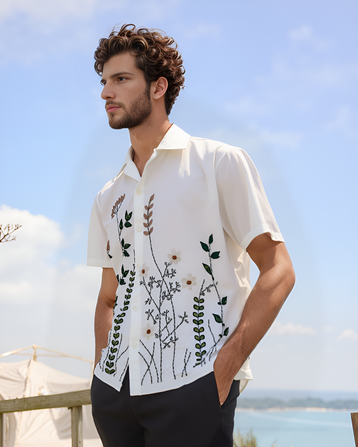
People choosing a custom piece usually spend a long time on the design and about four seconds on the thread colour. It is the wrong way round. Colour decides whether the work is visible at all.
The one rule underneath everything
Embroidery is read by contrast, not by colour.
Your eye finds the design because the thread is lighter or darker than the cloth behind it. Not because it is a nicer colour. Two shades with similar lightness sitting next to each other will blur together no matter how different they look on a screen.
A quick way to test any combination: imagine both in black and white. If they would look like the same grey, the design will disappear.
Try it: does this thread read on this fabric?
Pick a garment colour and a thread colour. Then run the squint test the way this guide describes it.
Reads cleanly.A strong dark colour on pale cloth is the easiest pairing there is, and fine detail stays visible.
Reads cleanly.Deep red is clearly darker than white, so outlines and lettering both hold.
Struggles.Yellow is nearly as light as white, so it blurs. Use it as an accent inside a design, not the main colour.
Nearly disappears.Pale on pale has no contrast. The name is unreadable from across a room.
Works.Clearly darker than the cloth, though less punchy than navy.
Chikankari territory.White on white reads as texture and shadow, not colour. Beautiful, but not for a name someone needs to read.
Invisible.Navy on black vanishes from more than a metre away. Dark on dark wastes every hour stitched into it.
Borderline.Deep red is only a little lighter than black. It shows up close, not across a room. Go brighter.
Sings.Bright, light thread lifts off a dark ground. Go slightly bolder than you would on white.
Lifts right off.Cream on black is a classic. Keep lines a little thicker, because black swallows fine detail.
Borderline.For a tonal look on black, pick a noticeably lighter blue, like sky blue, not a mid one.
Maximum contrast.Keep the design slightly bolder. Thin outlines get lost on dark cloth.
Works.Clearly darker than mid grey, the same way charcoal works.
Only just.Try the black and white test. These two sit closer in lightness than they look.
Works.Clearly lighter than the grey, so it reads.
Works.Cream is the safe light choice on mid grey.
Fails.Mid blue on mid grey sits at the same lightness and blurs together.
Works.Clearly lighter, crisp from a distance.
Too close.Navy is near denim in tone, and the weave's own texture eats the stitch lines.
Muddy.Deep red and denim sit at almost the same lightness. Fine in a close-up photo, muddy in person.
Right for denim.High contrast and bold, so it beats the texture of the weave.
Right for denim.Clearly lighter, and it reads over the weave.
Disappears.Mid blue thread sinks straight into the denim.
Crisp.High contrast is exactly what denim wants.
In black and white, if the thread and cloth turn the same grey, the design will disappear.
Thread on white and pale fabric
Pale cloth is the easiest surface to work with, because almost any colour is darker than it.
Strong colours land well. Deep greens, reds, navy and black all read cleanly on white, and fine detail stays visible because the background is not competing.
Two things to watch. Yellow and very pale pastels struggle on white for the reason above, so they work better as accents inside a design than as the main colour. And white cotton is the surface where the reverse of the stitching can shadow through, which is one reason we use heavier 220 GSM cotton. Our GSM guide explains why weight matters here.
White thread on white cloth deserves a mention of its own, because it is a genuine tradition rather than a mistake. Chikankari from Lucknow is built on it. It reads as texture and shadow instead of colour, and it looks quiet and expensive in daylight.

Thread on black and dark fabric
Dark cloth is harder, and more rewarding when it works.
Bright and light colours sing on black in a way they never do on white. Cream, gold, coral, pale pink and sky blue all lift off a dark background. This is why so much traditional Indian embroidery on dark ground uses warm bright thread.
What fails is dark on dark. Navy thread on a black tee is invisible from more than a metre away, and all the hours in it are wasted. If you want a tonal look on black, go for a noticeably lighter version of the same colour rather than a similar one.
Dark fabric also swallows fine detail. Thin outlines and small lettering get lost, so designs on black generally want to be a little bolder and a little more filled in than the same design on white.

Colour on mid tone fabric
Grey, olive, denim blue and beige are the trickiest, because they sit in the middle and can be beaten from either direction.
The safe approach is to go clearly lighter or clearly darker rather than trying something similar in tone. On a mid grey tee, cream works and charcoal works. Mid blue does not.
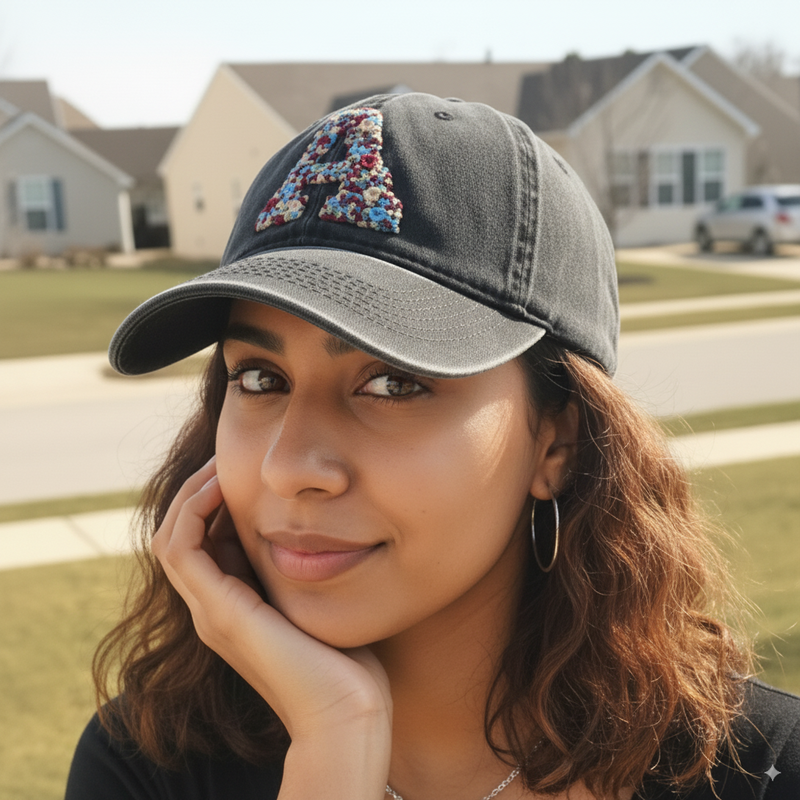
Denim is its own case. It is mid tone but it has visible texture, which competes with fine stitching. Bolder shapes and higher contrast thread work better on denim than delicate ones, which is part of why cap designs tend to read more strongly than the same motif on knit cotton.
Choosing colour for names and initials
Lettering is where contrast matters most, because text has to be readable and not just visible.
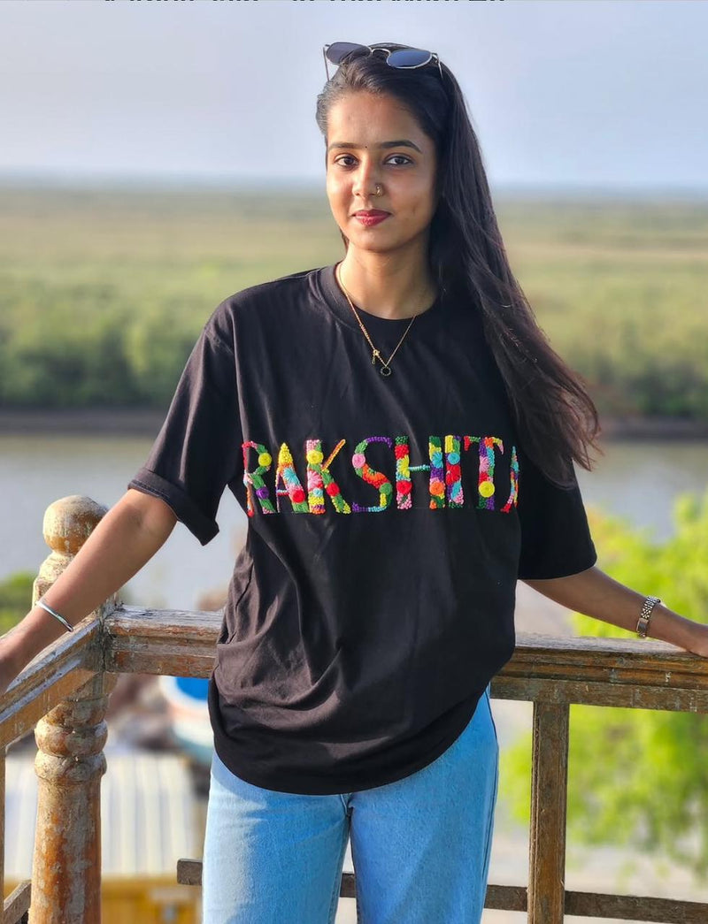
Go higher contrast than you think you need. A name in a colour close to the fabric looks subtle in a photograph taken up close and looks like nothing across a room.
For a gift, tonal is the safer emotional choice and high contrast is the safer practical one. If you are unsure, high contrast wins, because the person receiving it wants to see their name.
There is more on lettering itself in our guide to name embroidery styles, and placement changes how visible text is too, which we cover in the placement guide.
How many colours in one design
More colours is not better. It usually just makes a design busier.
Two or three colours is where most good work sits. A single flower in two greens and one red reads more clearly than the same flower in seven shades, because the eye is given a shape rather than a gradient.
Where multiple shades genuinely earn their place is depth. Two greens on a leaf, light on one side and darker on the other, gives it form. That is a different thing from adding colours for variety.
Same flower, three ways to colour it
More colours rarely make a design better. Switch between them and see which one reads.
Clear. One red and two greens. The eye is handed a shape, so the flower reads from across a room.
Busy. Every petal is doing something different. The shape dissolves into a gradient and the flower turns into noise.
Depth. Still only three colours, but each leaf is light on one side and darker on the other. Extra shades earn their place when they give form, not variety.

How colour behaves after washing
Worth knowing before you commit.
Good cotton embroidery thread is colourfast and holds its shade for years with cold washing. What actually dulls colour is not fading but coating, which is why fabric softener is worth avoiding. It leaves a film on the thread that takes the life out of bright shades.
Very dark fabric can lose depth faster than the thread does, so a black tee that has been washed hot for a year may end up with less contrast than it started with. Cold water protects both. The routine is in our laundry guide.

Deciding, quickly
On white or pale, pick something clearly darker. On black or dark, pick something clearly lighter and go slightly bolder with the design. On mid tones, avoid anything close in tone. For text, choose more contrast than feels necessary.
If you are ordering a custom piece and cannot decide, tell us the garment colour and what the piece is for, and we will tell you what we would stitch. You can see the range in our custom hand embroidery collection.







Share and get 15% off!
Simply share this product on one of the following social networks and you will unlock 15% off!